5 design tips for a successful retargeting banner ad
June 22, 2018
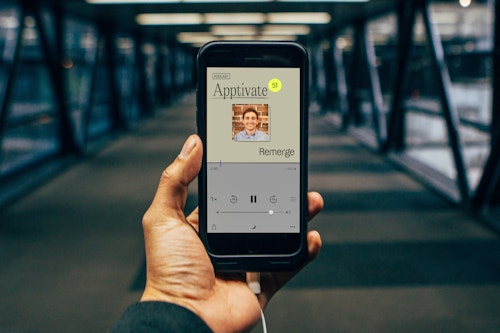
At Remerge, we have an in-house team of expert designers to help you craft creatives for every stage of your app marketing campaign. In this blog post, we give a rundown of how to optimize the design of a retargeting banner for the best possible results.
There’s a lot of things you need to bear in mind but we’ve boiled it down to 5 key points to help get you started.
1. First thing's first: the app banner's essential checklist
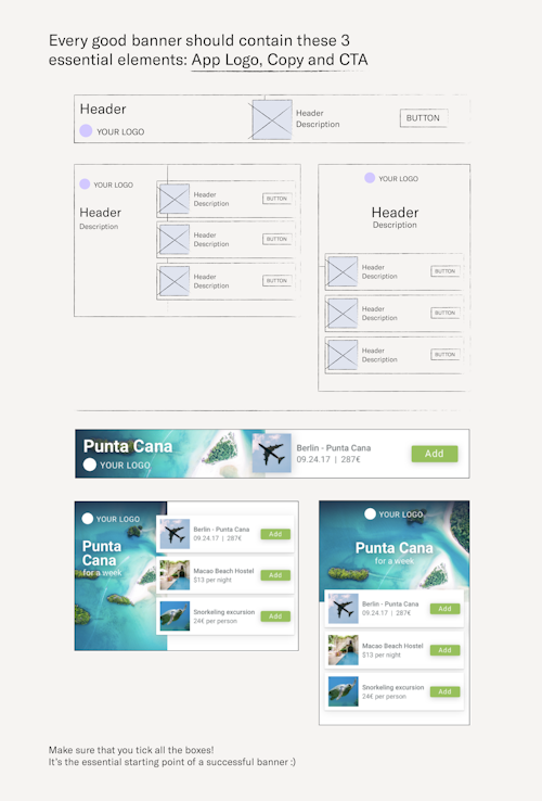
Every good ad should contain these 3 essential elements :
- App Logo
- Copy
- CTA
Make sure that you tick all the boxes! It’s the essential starting point of a successful banner.
2. Don't repurpose your user acquisition creatives
So your design studio provided you with a sleek set of user acquisition (UA) banners, why not just switch the « install now » button to « open app » and launch that campaign as quickly as possible?
Effective banner design is not only about the CTA - it’s also about the smart use of copy, images, and colors that make the overall concept work. The UA concept won’t always work for retargeting purposes, even with an updated CTA. Why is that? Well, UA banners are designed to gain your user’s attention for the first time and trigger an install. Retargeting banners on the other hand, should be about your user’s intent. What will drive them to come back into your app to complete a tutorial, a purchase, or a level? Definitely not a generic banner design.
3. Talk to your audience (personalize your ads)
When done right, app retargeting can offer a granular segmentation of your user base, so take advantage of this! Try to personalize your message for each type of audience. This can increase the banner's performance.
For Example: Non-purchaser ad: “50% off our pro version for two days only!” Previous purchaser ad: “Try one of our bonuses to get to next level!” Churned user ad: “We miss you! Have you tried our latest feature?”
4. Do it the C.R.A.P. way
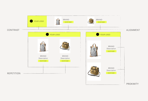
Basic design principles are relevant your retargeting banners, so here are four essential ones, sometimes referred to as C.R.A.P guidelines. These are four principles that you should consider all along your banner design:
Contrast: Give contrasting properties to the elements of your design, so they don’t get confused with each other. Contrast colors, shapes and fonts! Apply contrast to your CTA button by selecting a color that really pops.
Repetition: While contrast makes an element stand out, repetition balances this and gives structure to the overall banner. Be consistent in the way you display elements of the same level. Example: If you display two products on your banner, each product title should have the same fonts/colors/size.
Alignment: Banner elements shouldn't be placed randomly or arbitrarily. Proper alignment will increase readability and make your design more coherent.
Proximity: Group relevant informations together, and give space between the groups. White space is important, you don’t want to clutter your design.
5. Throw in a bone: everyone likes a good deal
If you can afford to entice your user’s way back into your app with a promotion, by all means do it. Discounts, free items, temporary plan upgrade, etc. This will increase the likelihood of users coming back to your app.
Download our full guide for designing mobile ads